Cutter Streeby holds an MFA from the University of East Anglia and an MA in Literature from King’s College, London. Publications, translations, and anthologies include The White Review, Chicago Quarterly Review, Hayden’s Ferry Review, Cincinnati Review and World Literature Today among others.
Michael Haight holds a BA in Creative Writing from University of California, Riverside and an MFA in Fine Art from Claremont Graduate University. His artwork has been exhibited in Los Angeles, New York, and Seoul. He lives and works in Los Angeles, California.
Tiffany Troy: What is ekphrasis to you?
Cutter Streeby: I’ve been interested in ekphrasis forever. When I was in Thailand, we started a journal specifically for ekphrasis called Verse Junkies. We had six different editors and seven different languages, featuring translations from live installation into poems, and vice versa. Ekphrasis to me, is not John Keats or the traditional way from the visual into a poem. To me, it’s translating across any medium. Ekphrasis feels like plastic. It’s an open and nebulous, shape-shifting thing.
Michael Haight: I think ekphrasis is just another mode of seeing. If I were to boil it down it’s like a translation. In some ways, it can be distillation, because the one who is creating the response through ekphrasis is distilling that which they find most important or what’s strongest in the work, so it’s concentrating the elements of whatever it is into some kind of refined image or refined product.
It almost makes you wonder if you do it back and forth long enough, do they get really simplistic?
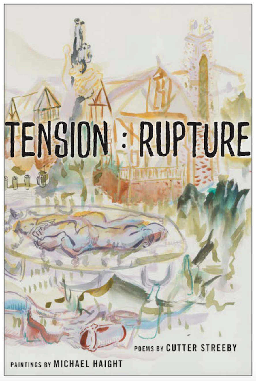
The root of Tension: Rupture are rites of passage and the human experience in dealing with that specific moment of change.
When I went into graduate school, I was a book arts instructor, and I was really interested in the relationship of image and text, especially in printed matter. The image was always on one side, with the text on the other. However, the image does not necessarily need to be an illustration of the text.
In 2008, I developed an automatic writing system to write about what was going on in my life, but only I could understand. It’s like writing from the heart to the hand and I built this because I was in a tough relationship where I felt I couldn’t really write or journal or keep anything to myself, without the other person getting involved in it, or like snooping around. This writing system eventually became the hand that I use when painting, and all my paintings have this kind of movement by the hand in every line. These strokes are a bodily description of the moment of the mind, almost like the divining rod, where various elements of the moment of the person are being recorded and on this canvas and so like the visual counterpart of an artwork is kind of like the words and elements being bounced off the mirror of my mind and reflected onto the page or painting through this kind of movement. I just happened to color it and make figures with it to make it into figurative painting where before it was figurative language.
Tiffany Troy: What is the collaboration process like and how is it different from the work that you have been doing before?
Cutter Streeby: When I was putting together my first full collection, I sent it to Haight and asked if there was anything he’d want to paint out of it and then maybe we’ll just do a chapbook. In my full manuscript, I have a section called “Frameworks,” which is the narrative theme that I kind of hung my poems around in—the skeleton I used to sculpt the poems. Haight picked that one out and from those he started his series which is you know thematically and linked. When he sent it back, it looked too narrative, so I picked poems that I felt resonated with his work, and then I wrote some new poems, and cut and chopped in transitions poems between poems.
In this collaboration, Ekphrastic agency changed hands many times. Originally, I was the creator, and Haight was the translator. Then I worked with Haight’s Crepuscules and became the translator. Then he translated those poems back into the detail shots in the book and I built the translations of his details back into poems. It was really like a creative dream—like a reverb chamber where the final product has hints of the originals, but is something completely new.
Michael Haight: With my artistic collaborations in the past, they were either kind of unbalanced or there wasn’t any room for anything new to be created. With Tension: Rupture it was more of a mutual kind of work-force between us. Each artists’ work inspired the next consecutive piece of the puzzle. For instance, Cutter had me send detailed shots of my paintings which he used to work on new poems.
Cutter Streeby: As Haight said, once you start arranging the poems and images on opposite pages, it sets the mood for everything, so if you have the wrong form over here on the left facing page, then the tone on the right page is completely flat.
Tiffany Troy: Michael, one cool aspect about your watercolor paintings is how bright and colorful they are. They are rainbow-like and dream-like. Can you speak about your color palette?
Michael Haight: To preface my answer, a crepuscule is a fancy way of saying twilight—just after sunset and just before sunrise, so it’s like a blue hour. I like that because it allows for a little bit of ambiguity, a little bit of choosing whether this is a beginning or an ending.
But I guess my color palette predates the crepuscular series, because when I was painting, I kept on thinking about ROYGBIV, and how colors lie next to each other in the light spectrum, and I was in this weird headspace where I wanted to refract the light, while considering the wavelength of colors, and the way particles move in a wave-like fashion, and then freezing that in certain parts of paintings. To me, it was a way of incorporating multiple perspectives, and like this weird way of thinking, how if you were able to, you could see the atoms right in front of your eyes, while at the same time, seeing a mountain in the distance. Or, in another way I thought I was making a painting in such a way that the viewer could see the atoms and the wavelengths of the photons but then the actual “thing” that is, the painting’s main subject, also being perceived. That’s where that kind of coloration comes from, that kind of separation of light, where if you see just one big brushstroke that’s because that’s just one big wave of light in that spectra or wavelength.
This color-play to me is related to moments where my friends and I drank from sunset until sunrise. There is always this point where you’re so drunk, and you want to keep getting drunker, and keep talking, and keep trying to answer these big questions and thinking that you’re going to achieve enlightenment if you do so, and there’s always this wishful thinking that the sun won’t rise until those questions are answered. Because at least, in my delusional mind at the time, that’s what I wanted, I wanted to stay up in the dark until I shed light on the questions, as if I were to become the sun. But just like the title, The Sun Also Rises, regardless of how drunk you are or how deep into some philosophical conversation you are the sun will rise regardless.
This kind of breaking up of the light in my color palette is like this moment when the sun rises. And it all of a sudden, is very bright and very hot and you’re very sweaty, and it feels like the sun is shining only on you, and you alone, and so it’s kind of a way of capturing that moment.
At the same time, the colors contrast with the dark situations that are happening in the paintings themselves. It is similar to how, if you’re under the influence, you’re not really seeing life for what is actually happening around you. You are only seeing how Kurt Vonnegut thought of how we see time, as being stuck on a rail car with our heads in a helmet that only has a tube over one eye that just lets us see out in a single fixed dimension.
The color palette is a way of showing that what’s outside of that tubed-helmet, is similar to what’s outside of Plato’s cave. The palette can provides a little levity, and kind of a little balance to the darker situations that are happening.
Tiffany Troy: How do you combine the more abstract elements, like the brushstrokes with the more discernible grounding elements, like the actual figures and objects in your work?
Michael Haight: I think of abstract elements as these big blobs of light which speak to the emotional elements of the composition. They’re definitely a product of my writing system, and my study of languages and Eastern Art. I had a minor in Japanese in undergrad, and I had to teach myself Korean to live in South Korea. I have a huge interest in 17th century Chinese art and Japanese woodblock prints. So my handwriting and painterly-hand is influenced by the muscle memory of these writing systems and their subsequent artistic cultures. Grounding abstract elements with the figure developments is just my way of balancing out the abstract in the figurative so that they can harmonize. Because there’s all these things that happen all around us all at once, and we can only understand them one at a time as we put two and two together with our brain, and it’s like everything else is kind of white-noise.
The abstract elements are like that white noise—those things that we don’t yet understand, or we haven’t yet processed—and the figurative things are the things that we are able to see at least as clearly as we can, and I think that applies with this series in Tension: Rupture because these paintings are all referencing situations that happened a decade ago, so I’m going through and having to remember them, and having to ask people that I knew, who were in the scenes, to corroborate the facts, and fill in the fictions, and patch together the things that I remember with what they remember.
Tiffany Troy: How do you determine what to accentuate like besides what are less focused?
Michael Haight: It’s kind of like the way a photographer decides the depth of field of an image. Roland Barthes’s idea of punctum. The punctum is that point where the photographer wants the viewer to start when looking at the image and then go from there. It’s the punctum that is detailed and in focus. When there’s like a short depth of field in the painting, everything else is going to be blurry, and be situated as supporting roles to the main action. Sometimes I’ll make a painting that has a really large depth of field where everything is in focus. It’s like if the camera was set to f/16 or f/22. In that case, the composition is more about all these elements hanging together being interspersed on top of one another, rather than one main event being the sole kind of focus, and everything else just being secondary.
Tiffany Troy: Cutter, how do form and the different languages interact with each other in your poems?
Cutter Streeby: I like to think of poets as painters because we do the same, literally, I think, the same with language. Maybe it’s just the poets I like. You get Paul Valéry who is an abstract painter with words. Half the time, you have no clue what he’s talking about and then you get like one or two lines down at the bottom and the whole poem clicks. Those are my people; people with a strong sense of formalism drifting around. Abstract but still tied to humanity.
So, when I developed the colons and the form of my writing for this collection, I started noticing it like music—the “normal poem” layout puts so much pressure on the line and the line breaks and to me it just felt so… dramatic: “Yeah, we know there is a break here; we get it; cool story.”
If you center the poems and let the breaks be arbitrary, then that pressure is relieved and it doesn’t feel so artificial. The whole poem becomes a kind of totem or a Rosetta Stone. I really, really like “hard” poets like Pound or King Los or anyone that you have to go back to and listen to or read twenty times over and always there is something new there, so those are the poems I like to write. And with this block form and colon breaks, it felt heavy on the page, like a proclamation or something.
Language is like a different brush or a different color for me. When you put Latin in, you know we’re talking about something serious. This is when language still shared a one-to-one relationship with things in the world and it didn’t have this huge slippage that it does now, after Wittgenstein, where it’s like a rose, is a rose, is a rose. Latin feels to me more serious and heavier. Like that smoky vibe kind of, wooden-church-pews, swinging-smoke-thing kind of feel.
Spanish, to me is just faster and so much prettier than English. It is like Lorca to me. Most of the poems I wrote while I was in Granada or, I was editing while I was in Granada and most of the Spanish I stole from conversations I was having at the time. Spanish has a different musicality to it and a different a/illusion for me. To me, the Spanish just gives me another voice and another brush stroke with a whole range of different chromatic hues. Sometimes it’s a female voice, most of the time actually it’s a female voice in my head.
The double colon acts to me like the traditional line break and three for a stanza and somehow this feels to me freer. Like I can switch easier between speakers or ideas. The languages come in like brush strokes or colors but you have to stop and look for them. There are many voices in my poems. When I write, I shift many times between speakers and that’s why I like Haight’s work. His work is busy, with a lot of voices in it, a lot of hands and formalist elements. You can read the polyphony in Haight’s work.
Tiffany Troy: You’re entirely right. It was like a polyphony, where the visual motifs are translated or interpreted like textual motifs and where the different voices tell stories that are focused on things that are happening around that scene that is set up.
We talked a little bit about the details that you selected from Haight’s paintings and then sort of created your own poems out of it, and how that sort of makes the work pop. What is that process like?
Cutter Streeby: These coffee table art books always have details of this or that element within a painting. A brush stroke close up or a transparency of a color, and when I was selecting my own “details” from Haight’s work, another translation between us, I thought, “Hmm... I should write some details of a few poems as well to balance it out.”
I just finished The Tradition by Jericho Brown and he had this form called a Duplex and it was a kind of ghazal form. I stole the first “Detail” form from him. One of them is pretty much one to one (he has instructions on how to write them up at the Poetry Foundation) and I adapted other details from there. This was the coolest thing for me, finding the idea of a “detail” poem that I lifted from Haight and art books more generally.
I have a poem titled “One” (the poem with no gendered pronouns) on the left facing page and I pick out a “detail” from that poem and make it its own poem, in this case “Detail: Heliotrope”—it’s like a macro shot on that single word. You can zoom in ultra-tight and then that idea, that theme or word becomes so much deeper. Having two pieces facing each other, one a full poem and one a macro, “detail” from that poem really emphasizes the space between pages, the kind of contextual, liminal space that exists between the works. I thought that was so rad.
Tiffany Troy: My next question relates to the fluidity of figures and language in your work. How do you allow for differences in genders, cultures, and languages?
Michael Haight: In a lot of my work, the bodies are non-gendered so that they are able to be interpreted by everyone, regardless of how they identify. I do that so the reading of my paintings are more open and less constricting. When I work with language and culture, I incorporate what I know when it fits into context. With “Alcoholic Crepuscule #15 (Guri City), the painting is based on the city of Guri in the state of Gyeonggi-do where I lived for a year. The piece is an amalgamation of a lot of what happened to me in South Korea in terms of drinking until sunrise, and the drinking culture there. In the top corner of the composition there’s this Royal Graveyard called “The East Nine Royal Tombs,” that is just outside of where I lived. They’re all in the background along with the different mountain-side burial mounds that are part of traditional Korean culture. Then in the foreground are bits of Korean text that are all inside jokes and scattered between the foreground and background are green bottles of soju.
Some of the tension in the piece is based on my experience in Itaewon. That neighborhood is a very international and multicultural part of Seoul that’s near an American military base. Whenever I was in that part of town, I’d notice that the soldiers, when they’d be off duty, would just go around and treat the place like shit. I didn’t want to be associated with their disrespect for the culture: not learning the language, not speaking it, talking dirty or being offensive around the older folks. I learned early on what not to do when living abroad. I was over there, working and sending money back to where I came from. I tried to do my best to treat it with kindness because it was like being at someone else’s house and being a guest there.
My response in this piece contains my attempt to navigate being in this place where I didn’t know the language very much but wanted to assimilate and not stand out as the ‘big, loud American.’ In doing so I realized, there was an entire week that went by where unless I was at work, I didn’t say a word to anyone. I would speak Korean when I needed to but other than that that’s all that I spoke, I didn’t speak English, and therefore I wasn’t expressing anything beyond utility. I definitely felt a kind of separateness, despite being an ‘honorary Korean’ according to my friends. I still was always the observer, even though I had people tell me that I fit in, nonetheless there was separation.
Cutter Streeby: On my side, in “Heliotrope,” I literally took all the gendered pronouns out completely. I chopped them out because like Haight said, one reader’s reading is so completely different than another reader just based on how they identify. I just took them all out so that you know there isn’t that option it’s just a human being in there. In the next poem, there are no gender pronouns now it’s collective pronouns on the detail on that piece, you know so to leave it open. I also have two boys, and I don’t want to have any of this toxic masculinity in my poems.
Tiffany Troy: I feel both of you definitely did something entirely new. I was curious about the fluidity in the painting and in “Heliotrope.” I love how the viewer can interpret how the reader likes and I think that’s what is so fascinating about your collaboration with each other.
What are you working on today?
Michael Haight: I have a solo show coming up at One Trick Pony in Los Angeles where I’ll be showing paintings from a series titled “Karmic Devices.” I’m also working on larger versions on canvas of the 15 paintings in this book. When I’m done with those I’ll be looking for a gallery to show them all together in one space.
Cutter Streeby: I’m putting together a collection that includes some pictures and visual elements.
I also started a 501(C) nonprofit for publishing artists and writers under 19 and I feel, as with my friend and co-founder, that if these children had an outlet where they could have their work published and taken seriously, they would stick with the creative process and mindset. I hope that the children don’t just kind of forget about this creative impetus that’s in all human beings. I think everybody at some level wants to create something.
A Suite of Poetry Films
Tiffany Troy is a critic, translator, and poet.